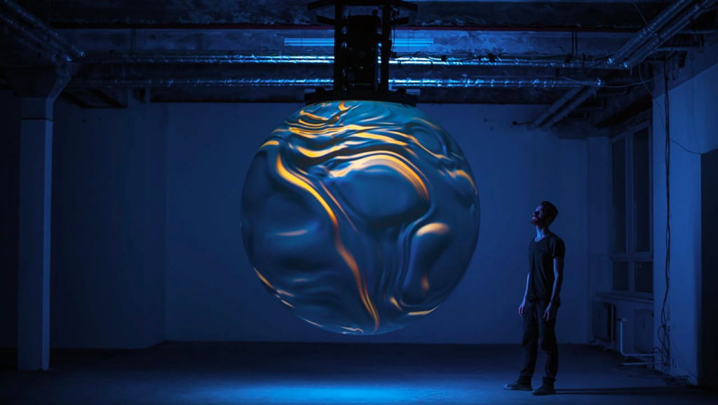
Blog: Pufferfish’s Cinematic Revival

Pufferfish’s Cinematic Revival: Our New Brand Identity for a Bright Future

In the fast-paced world of technology and innovation, staying at the forefront of the market can be a challenge. A brand’s visual identity can have a pivotal role in the way the company is perceived by the public. Often, it can make the difference between whether a company with a quality product sinks or swims.
For the past two decades, Pufferfish has proudly led the industry in spherical display technology. We’ve continually developed unique solutions, satisfying an enviable client list that reads like a who’s who of principal brands in their particular fields. Despite our market dominance, our brand hasn’t always reflected our position as a market leader.
Since Elaine Van Der Berg took the helm as Pufferfish CEO in May 2022, we’ve witnessed a recharged balance sheet, enhanced management team, improved product range, and developed sales and marketing functions. We used a funding injection secured in late 2022 to catalyse business growth and new product development plans. With this fresh start came the need for a new public image, a revitalisation that went beyond our products and solutions. In a bid to better reflect our position and aspirations, we’ve unveiled a new brand identity, one that brings a cinematic aspect to our image and sets the stage for a bright future.
A Journey of Self-Discovery
Our decision to embark on this journey of rebranding was a strategic move to align our visual identity with our corporate values and market position. As a company that has always excelled in our field, we understood that our image needed to reflect the innovation, leadership, and creativity we bring to the table.
For years, we’ve been the market leader, but we didn’t necessarily look the part. Our previous brand identity, while functional, lacked the charisma and resonance that we felt we deserved.
With a portfolio of work creating digital products for the likes of the BBC, Bowmore, Aston Martin, Virgin Money, and the Scottish Government, Edinburgh-based design studio More Yum were the ideal choice of partner to empower the Pufferfish brand to flourish. Their ample experience in combining innovation with sleek design and powerful storytelling indicated that More Yum would understand our goal to present clients’ narratives with clarity and flair.

Lights, Camera, Action: The Cinematic Touch
When we decided to revamp our brand identity, we didn’t need to look far to fuel our imagination. Drawing inspiration from other admired brands in the audiovisual and immersive technology spaces, we sought to create an identity that was both visually appealing and emotionally engaging. Just like a well-executed film, our new brand identity tells a compelling story.
Cinematic elements such as dynamic typography, dramatic colour schemes, and attention-grabbing visuals were incorporated into our new logo and branding materials. This infusion of cinematic flair immediately captures the essence of what Pufferfish does – creating immersive and visually stunning experiences.
The new brand identity started with a new logo: an invitation to imagine.
Embodying the abstract concepts of inspiration, imagination, and innovation, the logo highlights Pufferfish’s dedication to narrative and technology, while inviting existing and potential clients to imagine what stories could be weaved using our products and solutions.
The logo type provides contrast with a more confident and technical approach, utilising the natural rhythm of the word Pufferfish in a way that has become synonymous with the audiovisual category.
Our product names now follow a prefix system, cementing our position as a market leader and making the product range extremely scalable, by linking brand recognition intimately with the way in which people refer to Pufferfish products. The naming convention connects our physical products with software and content, further reinforcing cohesion within the product range and enhancing brand recognition.
Our typographic voice is distinct: clean, modern, and clear, with a nod to technology to support the wider narrative. A Variable font is used, a new technology of font that removes the explicit distinction between different weights and styles, which has existed since the early days of typesetting. This means fonts can seamlessly interpolate with Light and Bold, Regular and Extended. The custom version of the Antarctica Variable font is called AntPufferfish and is licensed exclusively for Pufferfish by New Glyph in Switzerland.
Our colour palette is mainly black and white, with a set of carefully tuned greys for text and panels. Reflecting our emphasis on creating spectacular visuals with impact, the most important aspect of the colour palette is contrast. Maximising the impact of images that show Pufferfish products in use is best achieved by displaying them alongside the most contrasting colour – typically, black.
Going hand in hand with the elements of logo, typographic voice, and colour palette is our tone of voice, guidelines for which should resonate with the visual aspects of the brand identity. We have simplified and streamlined the Pufferfish tone of voice, to ensure we’re always pointing always towards the human benefit behind Pufferfish products, rather than fixating on the technical detail, and consistently spotlighting the captivating stories told by customers using Pufferfish products and services.

The Results: A Bright Future Beckons
Our new brand identity isn’t just a visual makeover; it’s a statement of intent. It signifies a company that is ready to take on the future with renewed vigour and innovation. With our cinematic touch, we are not only rebranding but also redefining our industry.
The response to our new brand identity has been overwhelmingly positive. Clients and partners alike have praised our bold move. It’s clear that this transformation was not only necessary but also long-awaited. Pufferfish is now seen as a market leader in both substance and style.
Our journey from being a market leader to looking like one has been an inspiring one. Our decision to infuse a cinematic touch into our brand identity has not only revitalised our image but also opened up new horizons for our business.
This transformation serves as a testament to the power of a well-thought-out brand identity. It’s a reminder that in the ever-evolving world of business, a strong brand identity can be a company’s most valuable asset. Pufferfish has shown that with the right vision and inspiration, a company’s brand identity can help pave the way for a bright and promising future.